
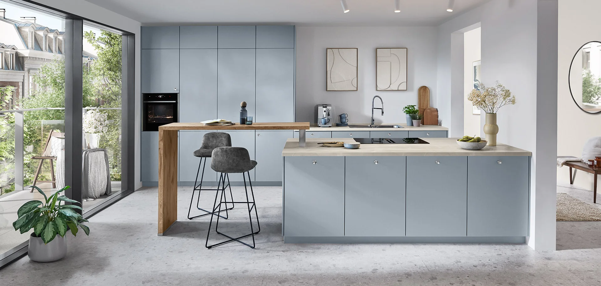
Begin with what stays
Flooring often occupies a large part of the view and influences the combination. Look at doors, windows, paint and living-room furniture too. Use any prominent pattern or tone as a reference before choosing the cabinet colour.
If everything is changing, first choose a direction: warm, neutral or more contrasting. You do not need every accessory immediately. Too many unrelated samples make a coherent combination harder to recognise.
A base, a supporting material and an accent
Choose a base for most cabinetry, a material that adds depth and a smaller accent. Sand, oak effect and graphite are one starting point; soft white, light stone effect and blue are another. Judge proportions by what will actually be visible in your room.
| Starting combination | Possible atmosphere | What to check |
|---|---|---|
| Sand + oak effect + dark detail | Warmth with defined contrast. | How the oak tone sits beside the floor. |
| Soft white + light stone effect + metal | A quiet, bright base. | Differences between the whites. |
| Soft blue + neutral + timber effect | Colour within a calm scheme. | How the blue looks through the day. |
| Terracotta + sand + plain stone effect | Warmth with a stronger identity. | How much colour a small room needs. |
These are mood interpretations, not exact paint codes or promises that commercial finishes will match.
Look at undertones as well as names
Two finishes called white may differ considerably when placed together. A grey can sit comfortably beside one timber tone and feel awkward beside another. A catalogue name identifies a product; samples help decide the combination.
Hold the cabinet sample vertically and the worktop horizontally, reflecting their real positions. View them near the window and deeper in the room, using the evening lighting you expect to have.
Choosing a contrasting island
A different island colour can help connect or distinguish the kitchen and living area. Decide whether its cabinetry, worktop or both should stand out. Strong veining, colourful stools and expressive lighting all need a shared direction if used together.
You can also keep the cabinet colour consistent and place contrast in a display unit or short section. A simpler scheme is easier to evaluate and can accommodate later changes to the room’s decoration.
Choose between complete schemes
Prepare two complete combinations instead of six isolated front samples. Include flooring, cabinetry, worktop and one detail in each. Photograph them as a record, but make the final decision with the real materials because screens affect colour.
Note what attracts you and what concerns you in each scheme. COSTAHAUS can study those references alongside the space and its light, then develop a proposal that also suits everyday use.